BUSUnited
BUILD UP Skills United (BUSUnited)
Communities of Practice (CoPs)
The identity is built on unity, growth, and European collaboration. The dot is the most elemental, universal symbol of connection — a minimal unit with infinite potential.
In BUSUnited, dots connect knowledge, people, and institutions, forming a living network that drives a sustainable future for construction.
Unite to advance. Connect to build. Share to transform.
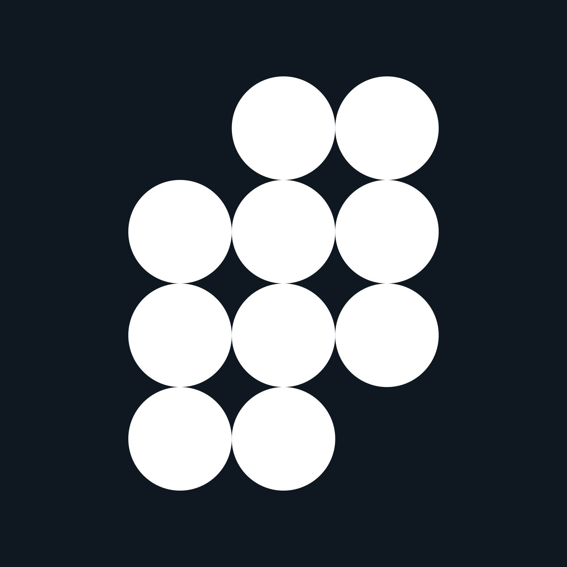
The modular symbol — 10 connected dots — represents the 10 Communities of Practice. Each dot is a node of knowledge; together they form a structure that is both organic and solid. Visually, it conveys:
Interconnection between industry stakeholders
Collective progress toward the green transition
Flexibility and growth, through a modular form that can expand
The symbol becomes a universal, flexible, evolving visual language — expressing the project's essence: a living network connecting people, ideas, and institutions to build the future of Europe's construction sector.
Credits
Year: 2025
Client: IVE (Instituto Valenciano de la Edificación)
Industry: Architecture
Discipline: Branding
Client: IVE (Instituto Valenciano de la Edificación)
Industry: Architecture
Discipline: Branding
Creative direction and design: Uve Francés Studio