
VALENCIAN INSTITUTE
of Culture
Starting from the premise that the new Valencian Institute of Culture covers different cultural areas, such as music, audiovisual/cinema, and dance/theatre, comprising several institutional entities, we needed a brand that took this diversity into account.
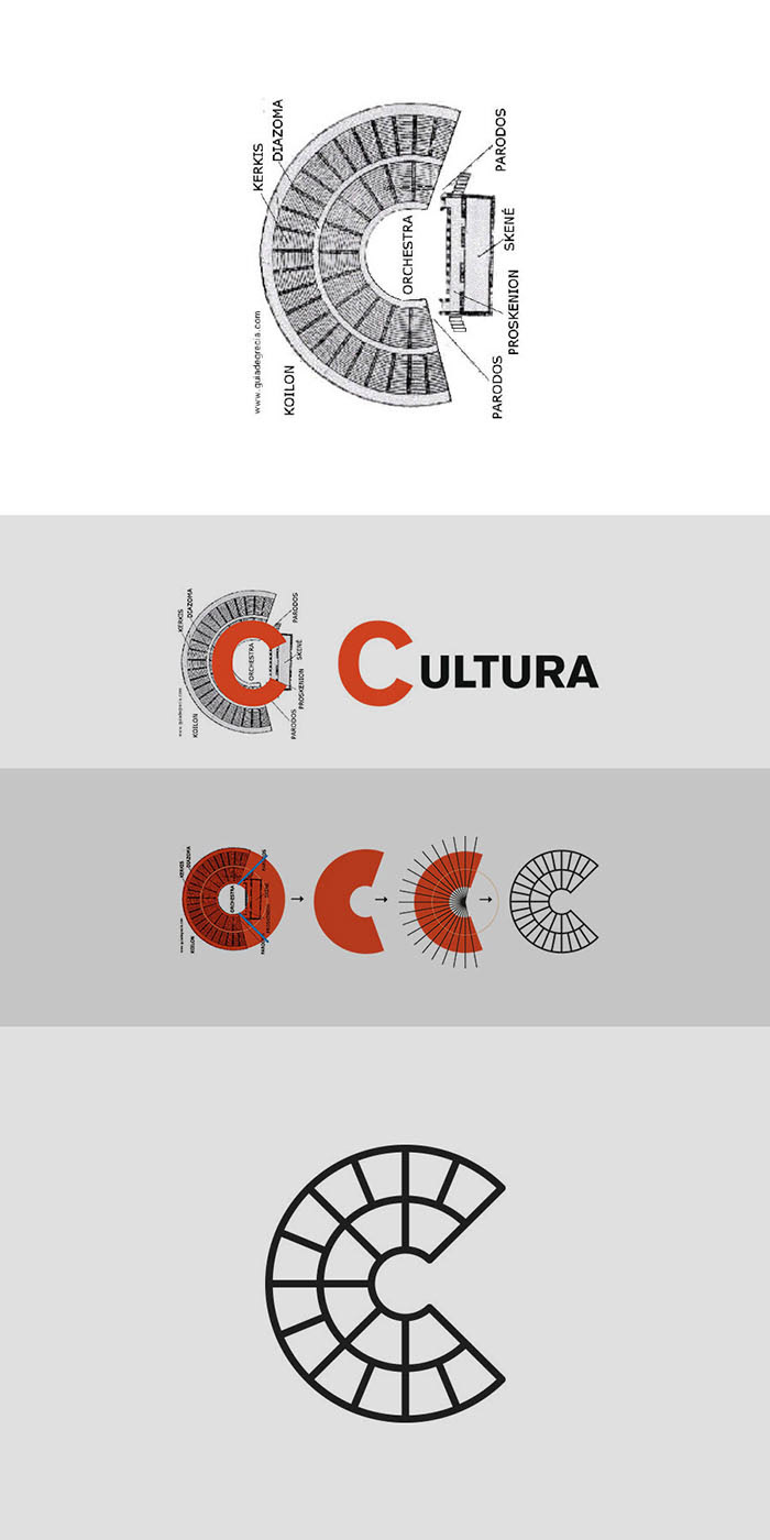
To carry out the brand, we focused on researching the common features shared by all the disciplines represented in the institute, namely the stage, the show and the audience.
We studied the origins and evolution of the space where all these disciplines took part throughout history. In ancient times, the theatre was understood as a physical space where all kinds of cultural activities were held: music, theatre, singing, dance… By analysing building plans, we realized that those abovementioned common features tend to be arranged forming a C-shape.
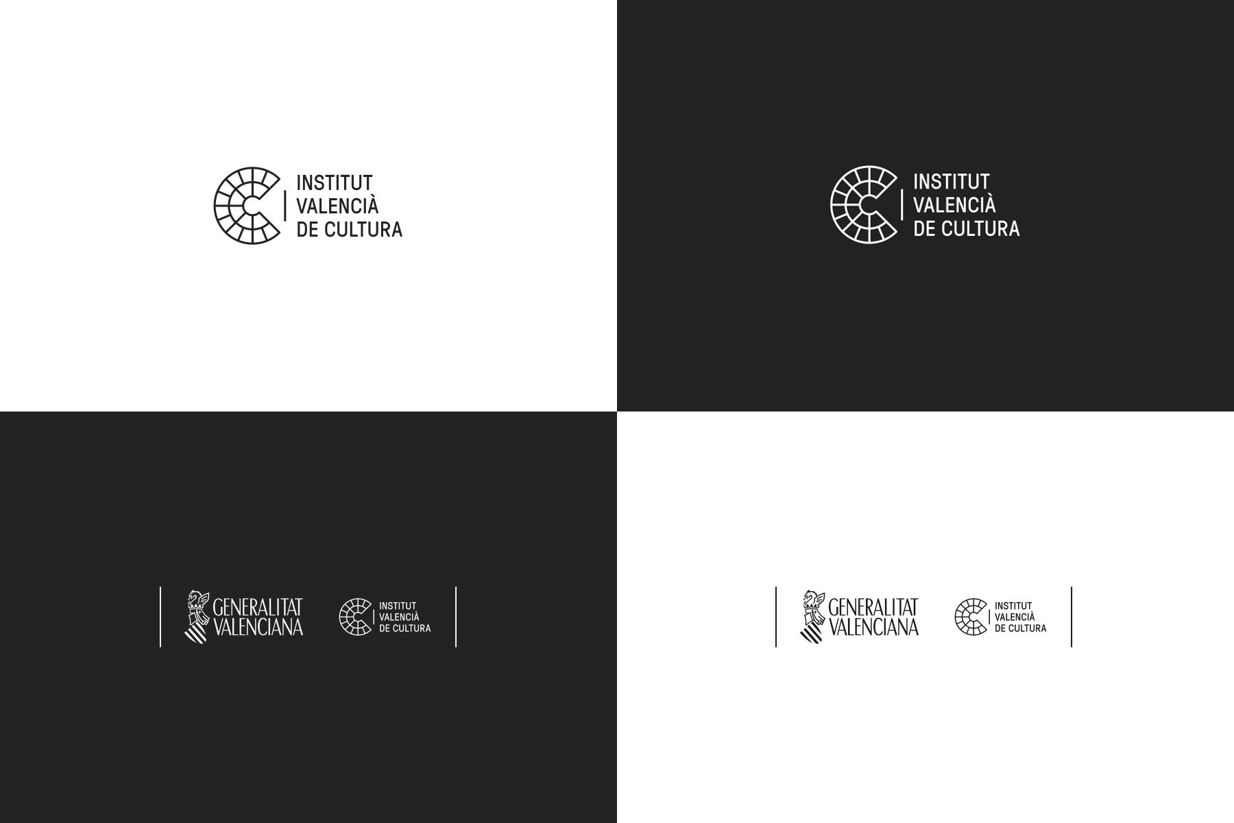
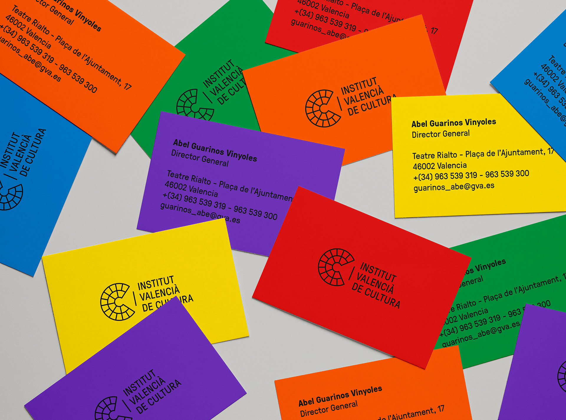
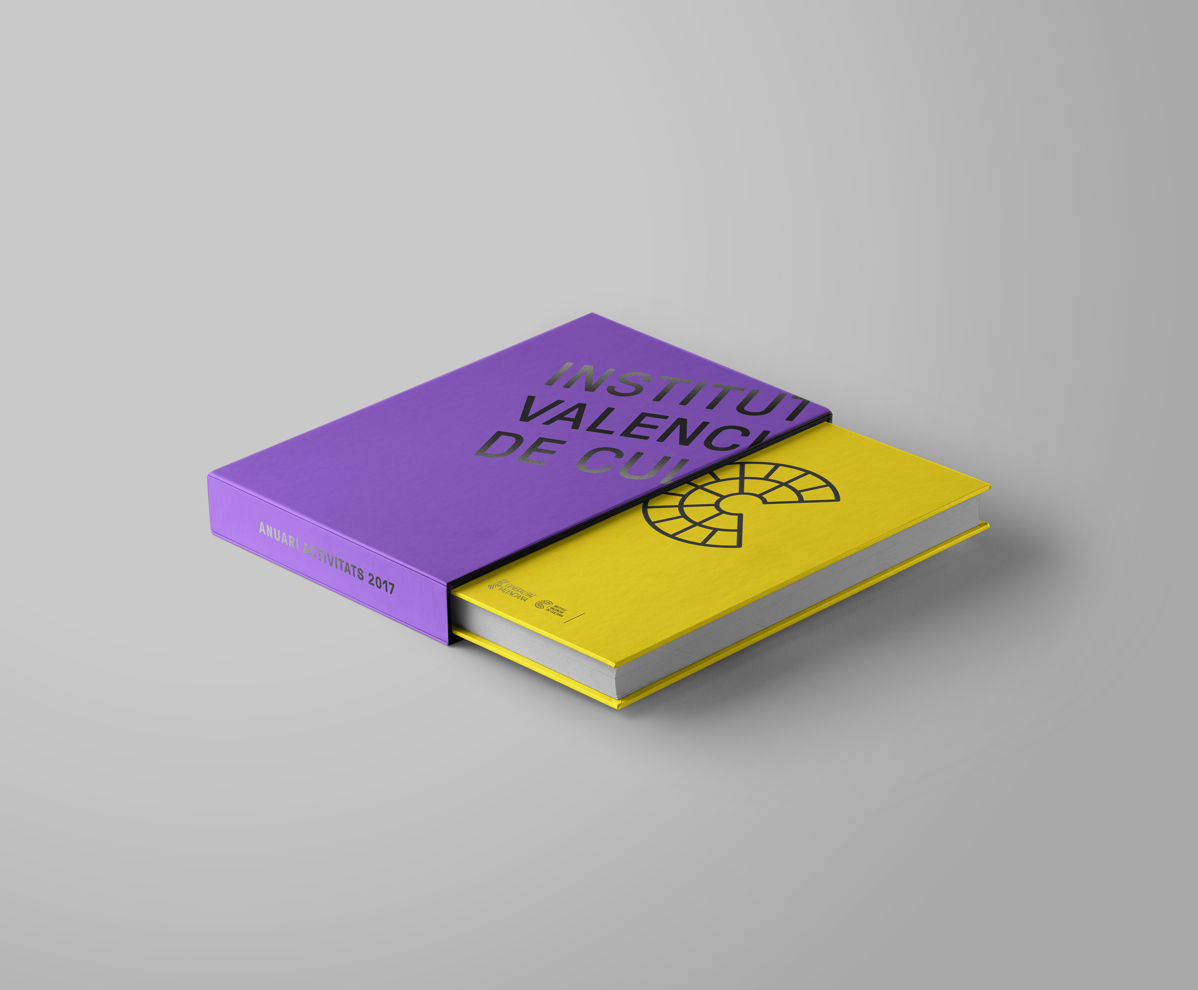
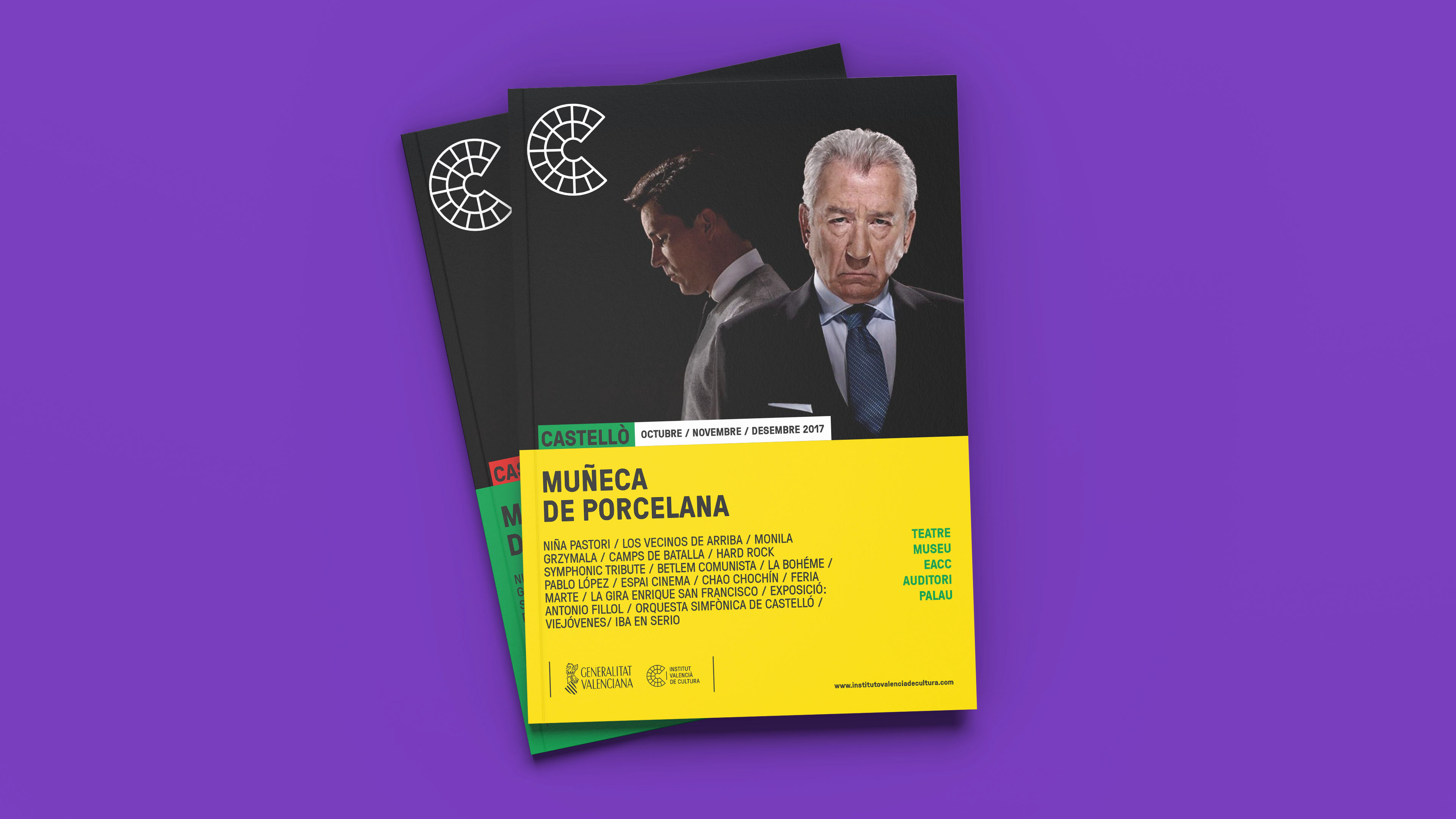
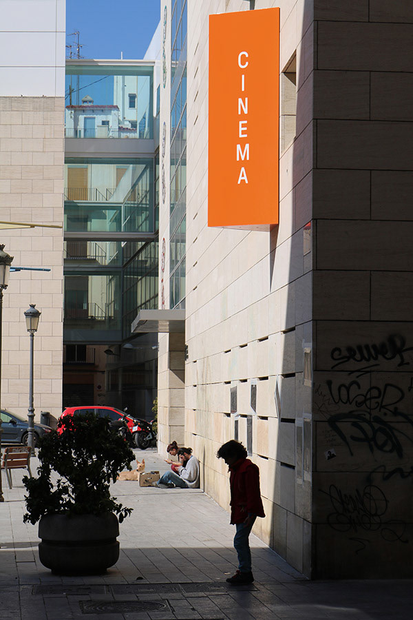
The brand for the Valencian Institute of Culture comprises a symbol, the letter C for Culture, and the typography with the Institute's naming.
C represents the Culture, the Institute’s central activity, taking its morphology from the space where this took place.
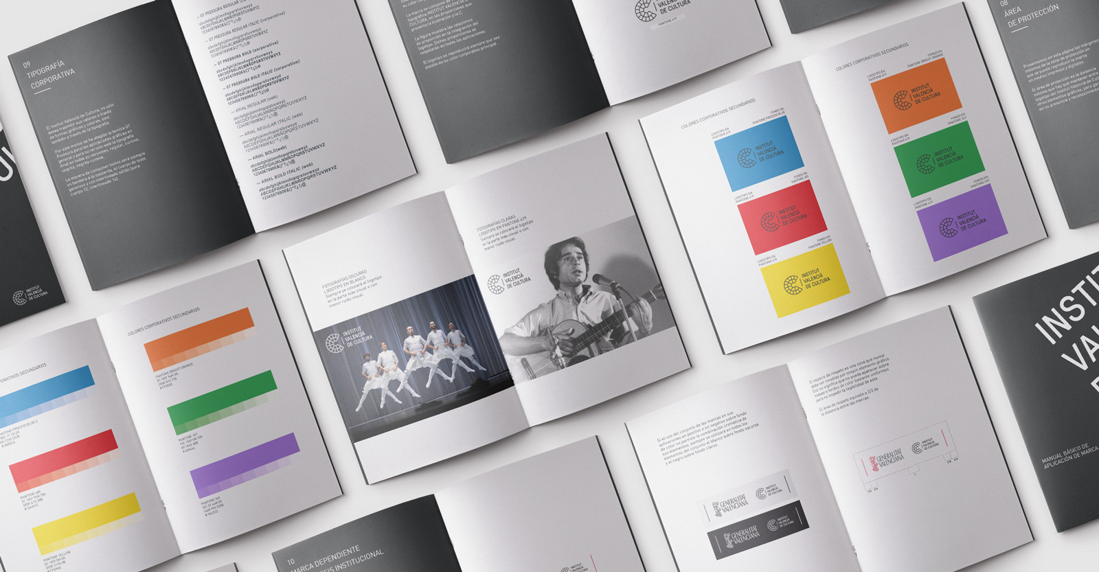
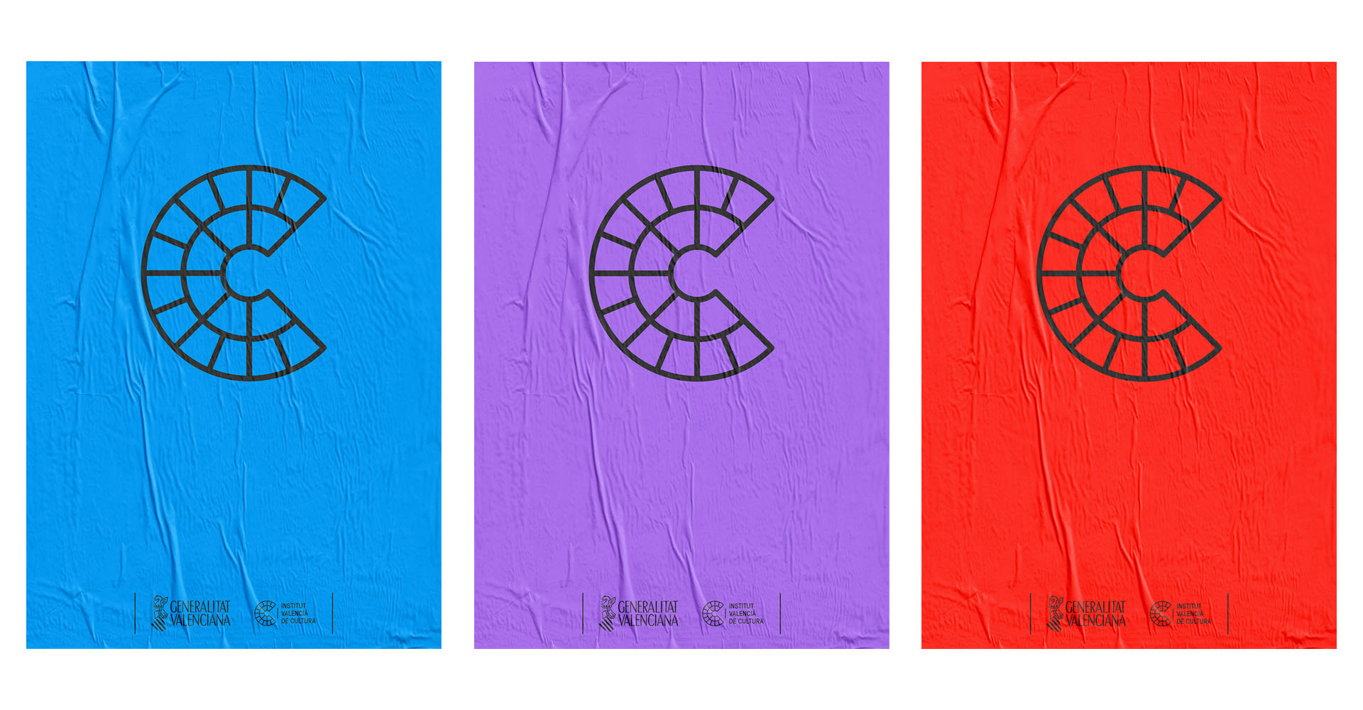
A strong brand, in white and anthracite black, with a clear, direct font, and a secondary colour range for the diverse applications to be developed in the second phase of the project.
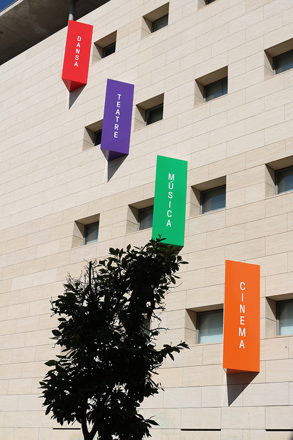
The colour symbolizes the diversity of areas, entities, disciplines and activities that the Valencian Institute of Culture develops.
The font used for this brand is GT Pressura, by Grilli Type foundry.
Credits
Client: Institut Valencià de Cultura. Generalitat Valenciana.
Year: 2017
Industry: Civic & Public
Discipline: Branding, Spaces, Production
Discipline: Branding, Spaces, Production
Creative direction and design: Ana Vañó (UVE) Francés, Cristina Toledo
Photography: Alba Prado